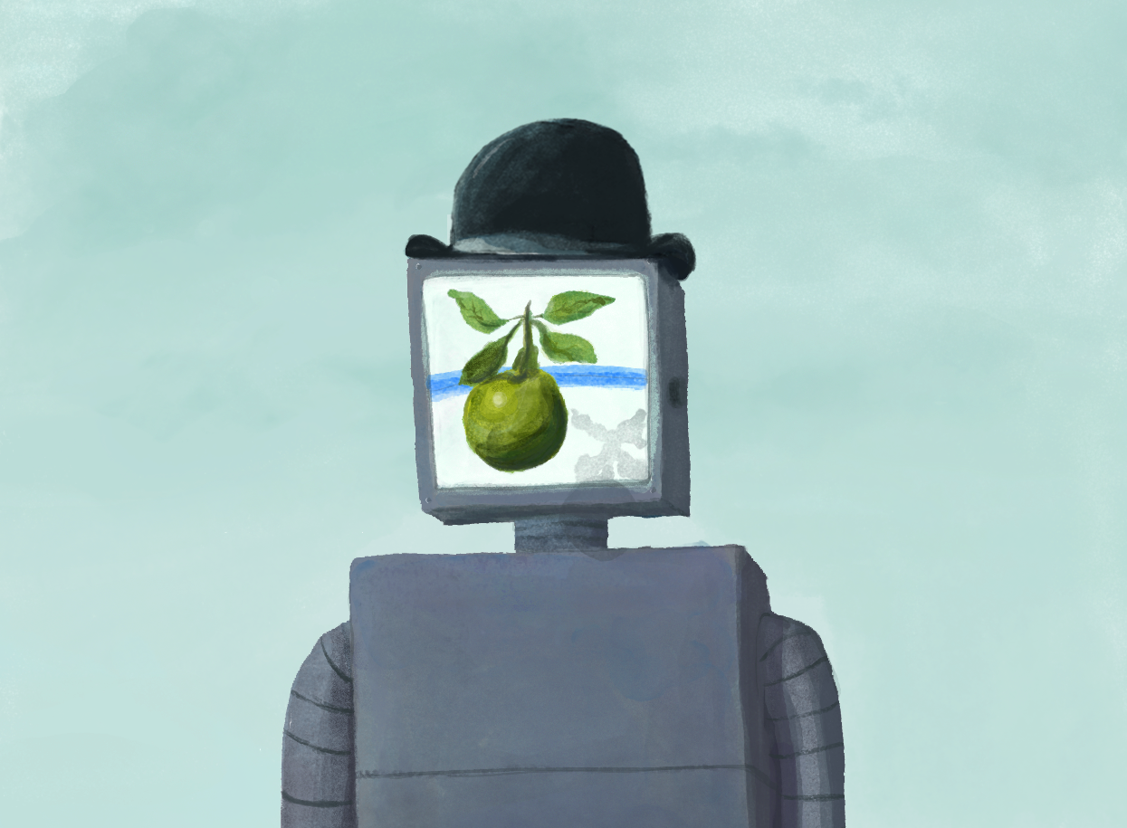
We went to Europe! And somehow, immersed in the works of the Continent's greatest artists, away from data roaming, I still managed to have my mind on the web... I recently shared some thoughts on the Domain7 blog.
I’m a sucker for modern art and, for me, no travels are complete without spying a local collection of 19th and 20th century greats. A recent visit to Brussels and Amsterdam offered a deep dive into two of my favourites: Magritte and Van Gogh, respectively.
Truth be told, I favour Magritte with his hyperreal detail and his way of challenging our perceptions of reality with accessible wit. I had the museum mostly to myself, and I had splurged on an audioguide. It was a diverse and interesting collection…. and yet I couldn’t wait to get out.
The experience was jarring and unmetered—and it was nothing I could blame on Surrealism.
Its shortcomings were only further illuminated when I visited Amsterdam’s Van Gogh Museum a few days later. It was packed, and yet, like everything in Amsterdam, the crowd followed an invisible but understood rhythm—a natural flow. I absorbed more; I didn’t feel like I was constantly backtracking or missing key pieces; I didn’t feel overwhelmed or impatient.
This is user experience design.
As I considered what made Van Gogh a delightful seamless experience, and what made Magritte frustrating and disorienting, I realized these museums offered valuable lessons we can apply to digital experiences:
1/ KNOW YOUR USERS
Brussels and Amsterdam are both international cities where English is the lingua franca. Where Van Gogh caters to the English majority, putting greater emphasis on English wall text and labels than Dutch, large swaths of display text at Magritte are only in French and Dutch. Know your audience and understand their needs—don’t cater to a niche at the risk of alienating a majority.
2/ SIMPLIFY
Magritte’s curators bog visitors down with detailed biographical timelines—elaborate histories that force art lovers to loiter and jockey for a view of tiny text. Van Gogh’s pull out the relevant highlights, making them bold, concise and visual, so you never need to linger in one place reading too long. Focus on the essentials. If there’s one thing you want users to do or know, don’t let them get sidetracked by superfluous details.
3/ REDUCE BARRIERS
At Van Gogh, floors are organized by theme, rather than chronology, so you can visit them in any order, to avoid traffic-heavy areas. Smart. Magritte’s prescribed chronology directs visitors through dark rooms where paintings are set against striking black walls and illuminated by megawatt lights. While it evokes the same sense of drama inherent in Magritte’s paintings, the reflected light makes it impossible to view paintings face-on—forcing visitors to stand at an angle. You never know how users will access your site. Reduce barriers at every potential entry point. Chances are they’ve come to do one thing—make it as easy as possible.
4/ GROUP LIKE-OBJECTS
Both museums feature works by other artists who either inspired, or were inspired by the museum’s namesake. Magritte’s curators intersperse these with his own works. The styles may be complementary, but they are clearly different, which is confusing until you read the label. Van Gogh’s curators, by contrast, devote specific rooms to works inspired by the artist. Consider where users expect to find things. Don’t subvert their expectations. This often means grouping like-objects together in ways that are easier for our brains to understand, according to the Gestalt principles.
5/ BE TRANSPARENT
In a room devoted to his process, the Van Gogh Museum gives a glimpse at the tools and techniques the artist used: infrared technology reveals how he repurposed canvases and used perspective frames to capture depth and proportion. Don’t rely on smoke and mirrors. The best web experiences are often the most transparent.
6/ BE AUTHENTIC
A bonus lesson from the artists themselves: both Van Gogh and Magritte are famous for their prolific self portraiture. They didn’t hide behind technique or preserve enigmatic status—they put their authentic selves on display. As should you.
originally published on Domain7.com

